
SoundGuide Manual
How to use the SoundGuide dashboard, page by page.
This manual follows the dashboard's sidebar. Each chapter covers one menu item: what the page is for, what you can do on it, and what every field and button means. Chapters marked administrators describe pages that only the Admin group sees by default.
The dashboard is at soundguide.hubbub.space. Which sections appear in your sidebar depends on your subscription: Monitoring and Reverberation are separate features, and Admin is always present.
Monitoring
Your sound-level dashboard: a list of widgets, each showing one or more SoundGuides over a period, as a chart, a heatmap, or a table.
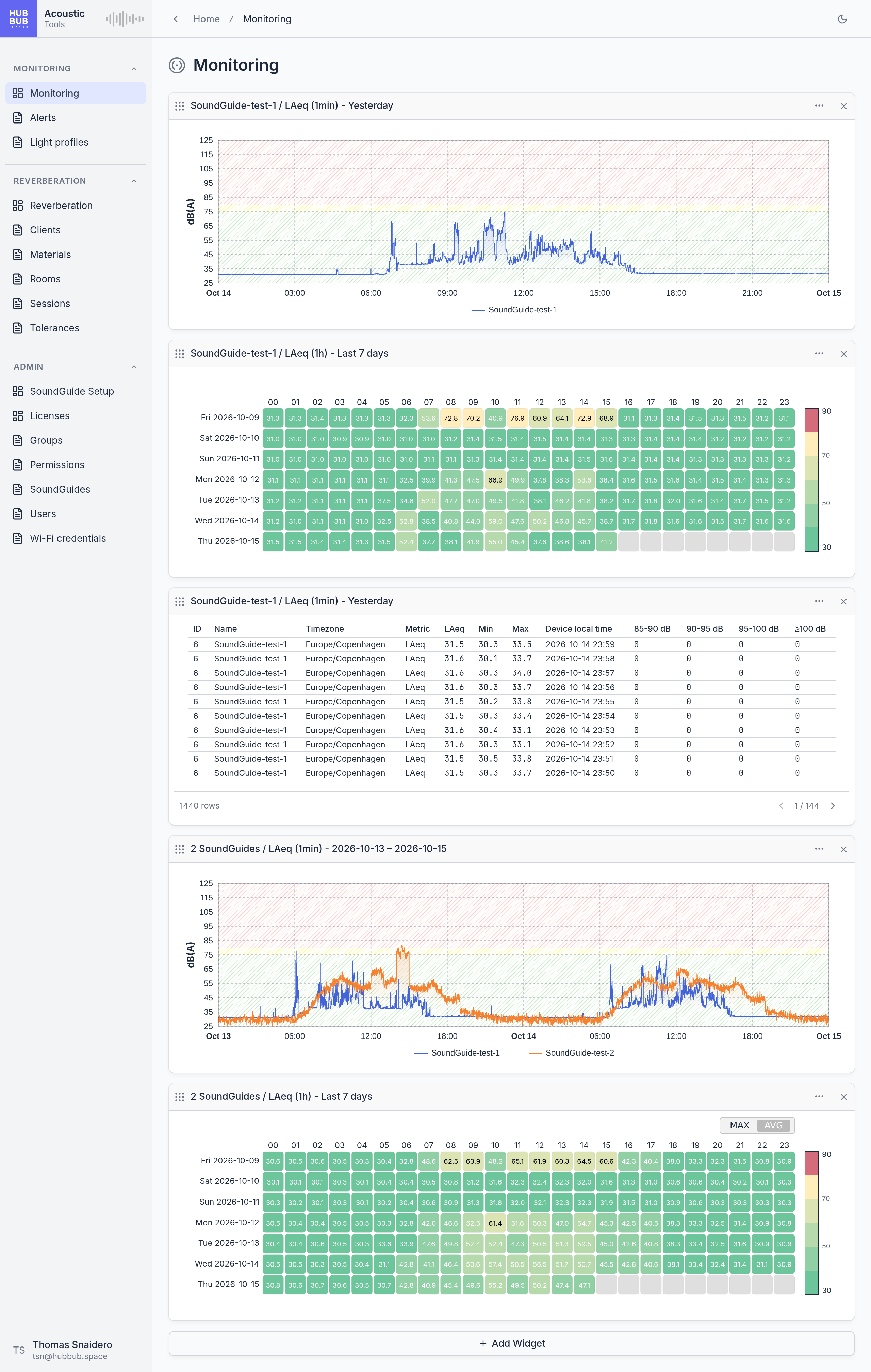
The layout is personal. Widgets you add, remove, or reorder change only your own Monitoring page, not your colleagues'. A new account starts with an empty page and an Add Widget button.
The three kinds of widget
Every widget has the same frame: a drag handle, a title that spells out what it shows, a … menu with options and downloads, and an × that removes it. What differs is the content.
Chart
Sound level over time, as one line per SoundGuide and metric. The coloured bands behind the line are the zones of the device's light profile: green below the yellow threshold, yellow between the thresholds, red above the red threshold, so you can see at a glance when the room was too loud. A chart can show several metrics at once, for example LAeq and LAFmax.
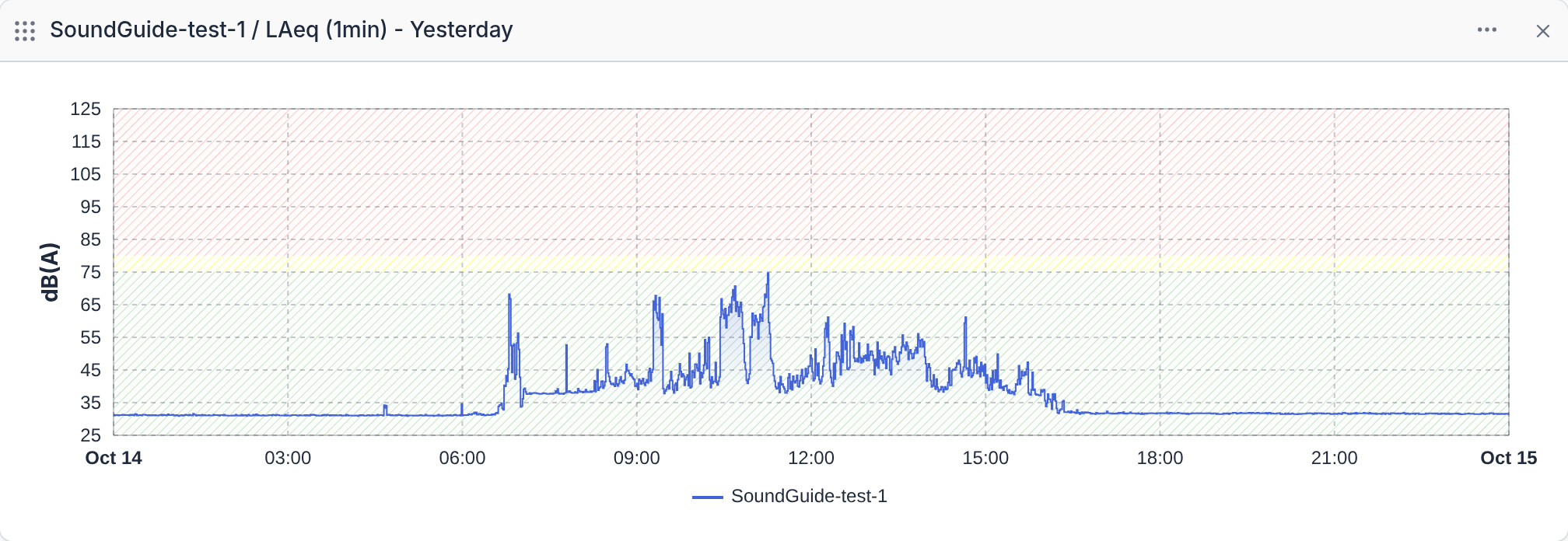
- Zoom: drag horizontally across the chart to zoom into that span. Double-click to zoom back out.
- Pan: drag with the right mouse button while zoomed in.
- Tooltip: switch it on in the widget menu to read exact values as you move the mouse over the line.
- Legend: below the chart, one entry per line.
Heatmap
One value per hour, laid out as a grid: a row per day, a column per hour, and a colour from green (quiet) to red (loud) according to the scale on the right. It makes patterns obvious: the morning rush, the lunch break, the one Tuesday that was loud all day. For periods of four weeks or more the grid shows one value per day instead.
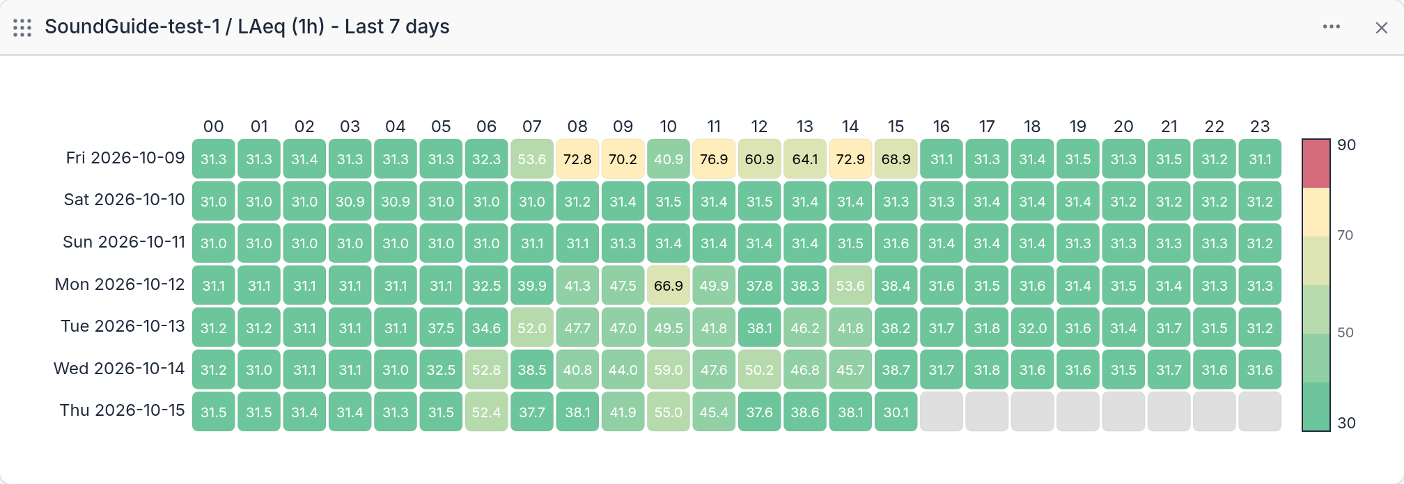
Hover over a cell to read its value. When the widget covers several SoundGuides, a small max / avg / sum switch in the corner decides how their values are combined into one cell.
Table
The same measurements as numbers, one row per time unit and SoundGuide, newest first. Each row shows the average (LAeq), minimum, and maximum level, the device's local time, and how many one-second peaks fell into each loudness band.
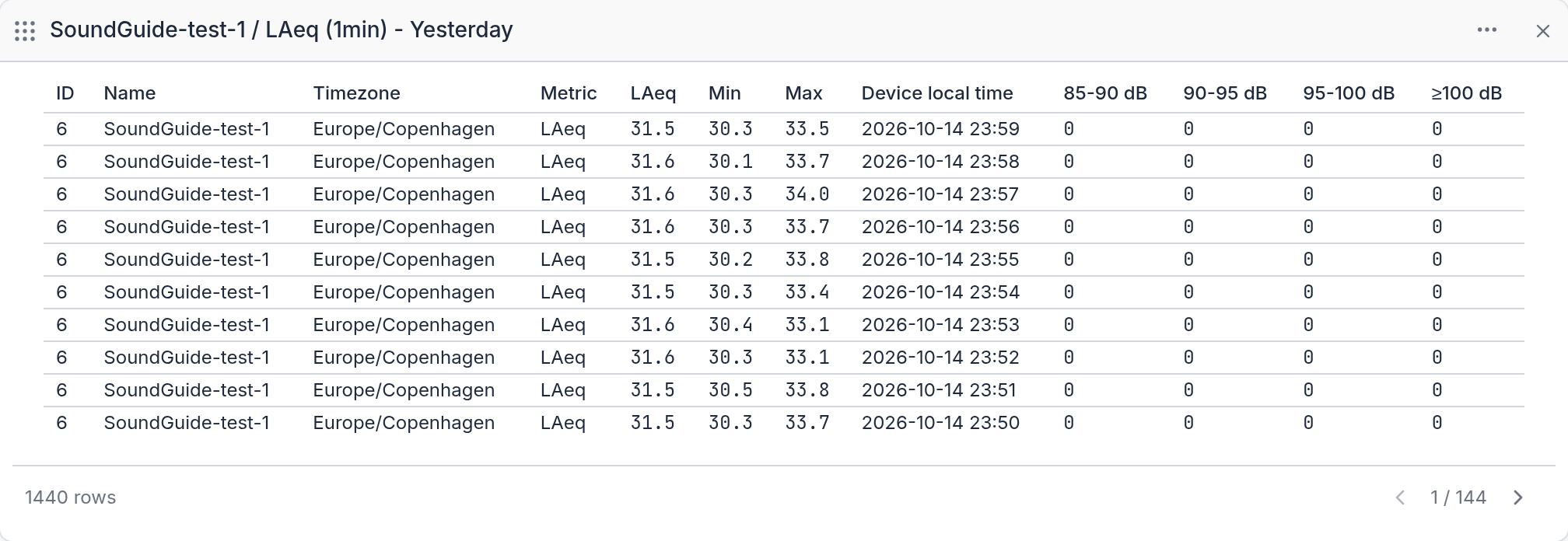
| Column | Meaning |
|---|---|
| ID, Name | The SoundGuide. |
| Timezone | The device's time zone, which all times in the row use. |
| Metric | Always LAeq for sound-level rows. |
| LAeq, Min, Max | Average, lowest, and highest level in the interval, in dB(A). |
| Device local time | Start of the interval. |
| 85–90 dB, 90–95 dB, 95–100 dB, ≥100 dB | How many one-second peaks in the interval reached that band. A second counts once, in the highest band it reached. |
Adding a widget
- Click Add Widget at the bottom of the page.
- Pick the Kind: Chart, Heatmap, or Table.
- Pick one or more Devices.
- Pick the Period, and for a chart or table the Metrics and the Time Unit.
- Click Add Widget. The new widget appears at the bottom of the page.
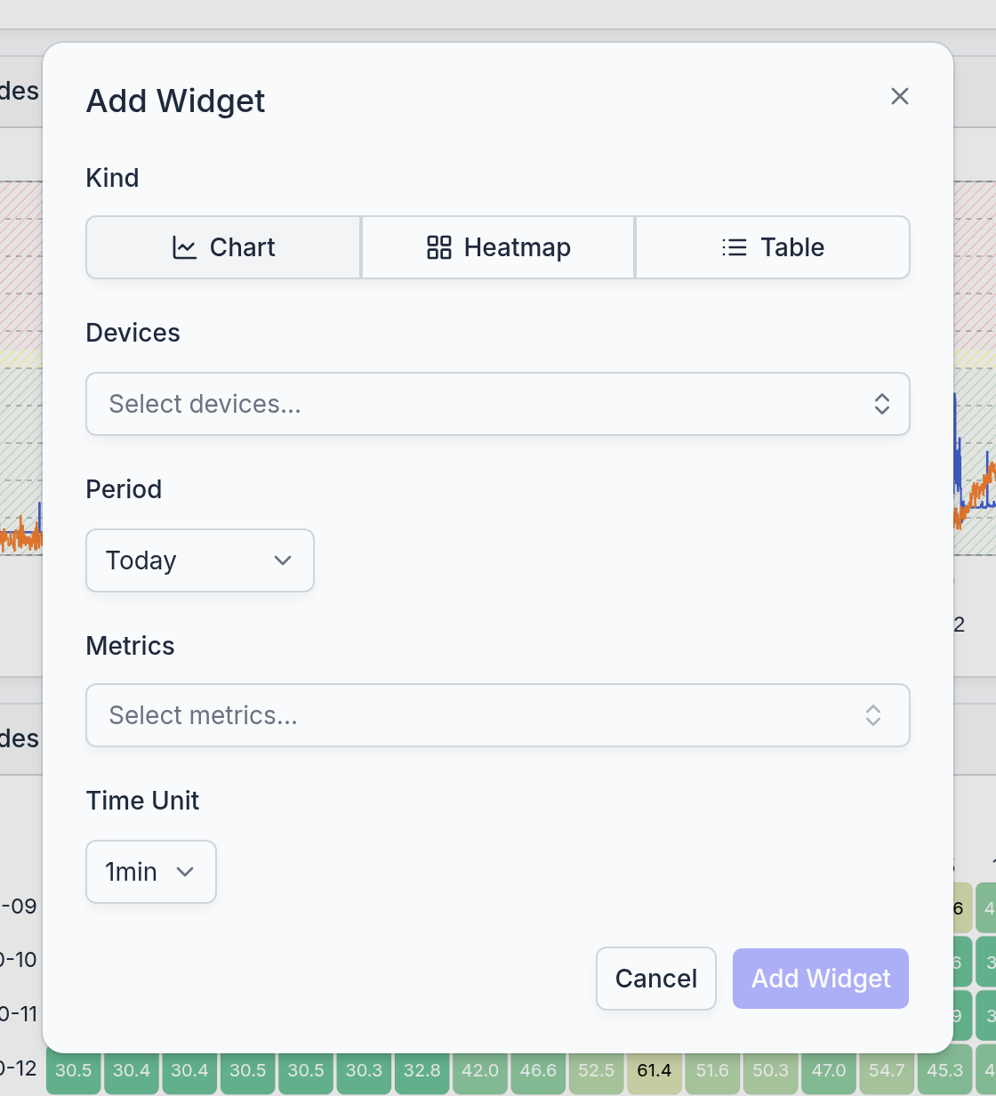
- Kind
- Chart, Heatmap, or Table, as described above.
- Devices
- The SoundGuides to include. Type to search. A device that is disabled, or that has no Monitoring licence, is listed but cannot be chosen, with the reason next to its name: such a device sends no measurements, so a widget over it would stay empty.
- Period
- Today, Yesterday, Last 7 days, Last 30 days, or Custom with a start and end date. Today and the other relative periods move along with the calendar, so a "Today" widget always shows the current day. A heatmap offers Last 7 days and Last 4 to 10 weeks instead.
- Metrics
- What to plot, see the table below. A chart or table can combine several metrics as long as they share a unit: dB(A) levels with dB(A) levels, counts with counts. A heatmap shows exactly one metric.
- Time Unit
- How finely the period is divided: one value per minute, hour, or day. The choice is limited by the length of the period, see below. A heatmap sets it from its period.
| Metric | Unit | What it is |
|---|---|---|
| LAeq | dB(A) | The average sound level over each time unit. The everyday measure of how loud a room is. |
| LAFmax | dB(A) | The loudest moment in each time unit. |
| All LAFmax peak events | count | How many one-second peaks reached 85 dB(A) or more in each time unit. |
| LAFmax 85–90, 90–95, 95–100 dB(A) | count | The same peaks, split by band. |
| LAFmax over 100 dB(A) | count | Peaks at 100 dB(A) or more. |
| Number of alarms LAeq, LAFmax | count | How often an alert fired in each time unit, for sustained noise or for sudden peaks. See the Alerts chapter. |
| Time unit | Longest period |
|---|---|
| 1min | 7 days |
| 1h | 31 days |
| 1d | no limit |
The widget's title is written for you from these choices, for example Room 12 / LAeq (1min) - Today, or 3 SoundGuides / LAFmax (1h) - Last 7 days when it covers several devices.
The widget menu
The … button in a widget's header opens its menu.
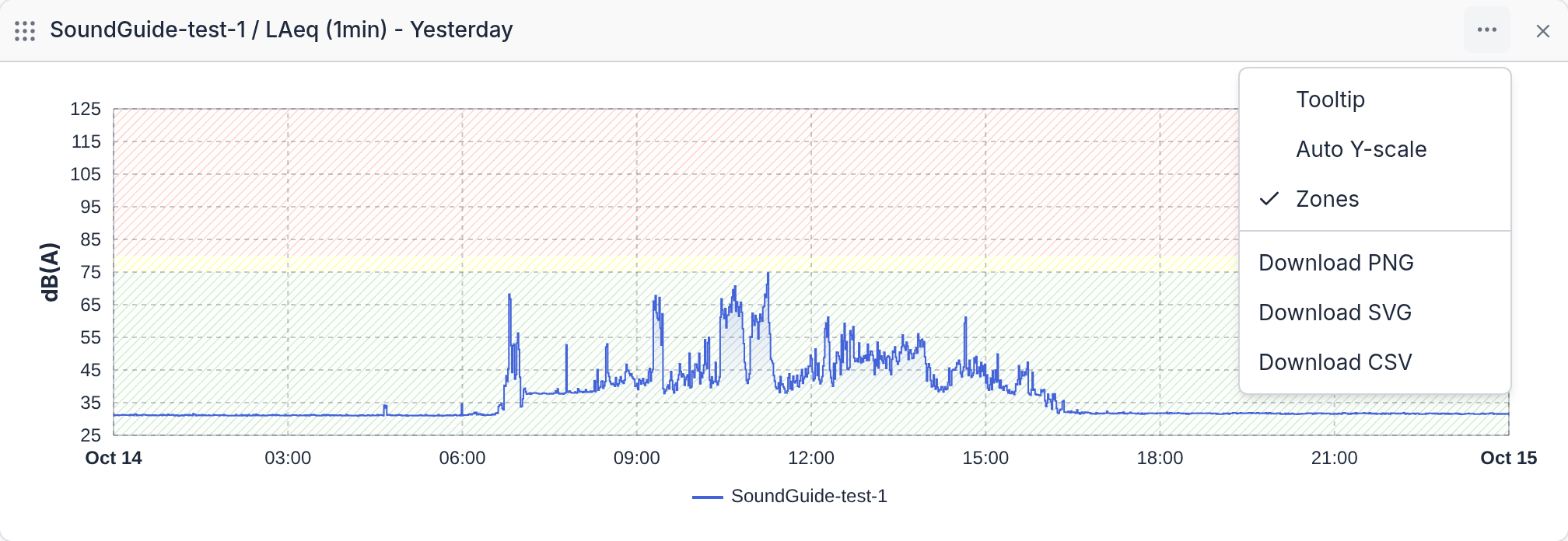
- Tooltip
- Chart only. Shows the exact value under the mouse.
- Auto Y-scale
- Chart only. Fits the vertical axis to the data instead of the fixed 25 to 125 dB(A) range.
- Zones
- Chart only. Shows or hides the green, yellow, and red bands.
- Download PNG, Download SVG
- Chart and heatmap. Saves the picture as it is on screen, for a report or an email.
- Download CSV
- All kinds. Saves the underlying numbers for a spreadsheet. For a table, every row, not only the page on screen.
The three toggles apply until the page is reloaded; the widget itself is saved with its period, devices, and metrics only.
Arranging widgets
- Reorder: drag a widget by the handle at the left of its header and drop it where you want it. The new order is saved.
- Remove: click the × in the header. The widget disappears at once, without a confirmation. To get it back, add it again.
- Change a widget: widgets cannot be edited. Remove it and add a new one with the settings you want.
Good to know
An empty widget usually means the device has not sent anything for the period: it is offline, switched to another mode, or has no Monitoring licence. A "Today" widget is also empty at the start of the day and fills in as the hours pass.
Times are the device's local time, set by the device's time zone, not your browser's. A SoundGuide in another country shows its own day.